
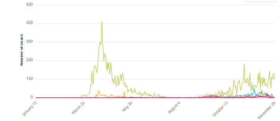
This article is going to be short and sweet – straight to the point with the data. Why are we locking down all Ontarians when we know that the vast majority of cases are from Long-term care and workplace settings?
The chart below shows 5 categories by daily number of cases – Long-term care (green), group homes or supportive housing (yellow), Elementary Schools (blue), Bars restaurants and nightclubs(pink), and Retail (purple).
Cumulative number of cases in Long-term care, Hospitals, Retirement homes compared to recreational fitness facilities and retail

Long-term care is purple, hospital cases are yellow, retirement home cases are pink, recreational fitness green, and retail is blue.
Active outbreaks by setting

Number of tests per day
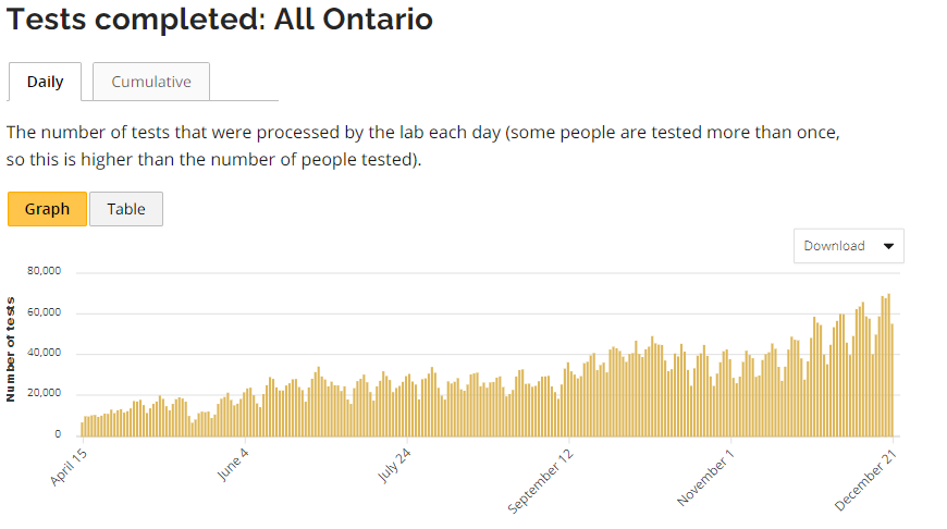
As you can see, testing per day has continually increased. This is also concerning as we are using the PCR test at high amplifications which isn’t an accurate form of testing – how many positive PCR tests were actually sick and exhibiting symptoms?
I’ll leave the reader with one piece of common sense – you don’t solve problems by focusing on the smallest aspect of them. We are doing precisely this with another lockdown that will further damage mental health, personal relationships and the economy. Thanks Doug!
