
By: Greg Staley
Written On: 2021-07-21
After examining data from the University of Oxford, I have discovered that 9 out of 25 of the most vaccinated places on earth (after taking out island nations) also place in the top 25 for the most deaths per 1 million people during Covid. There are many variables at play and so I will present the data with a warning – many other variables must be considered before conclusions can be drawn from this information.
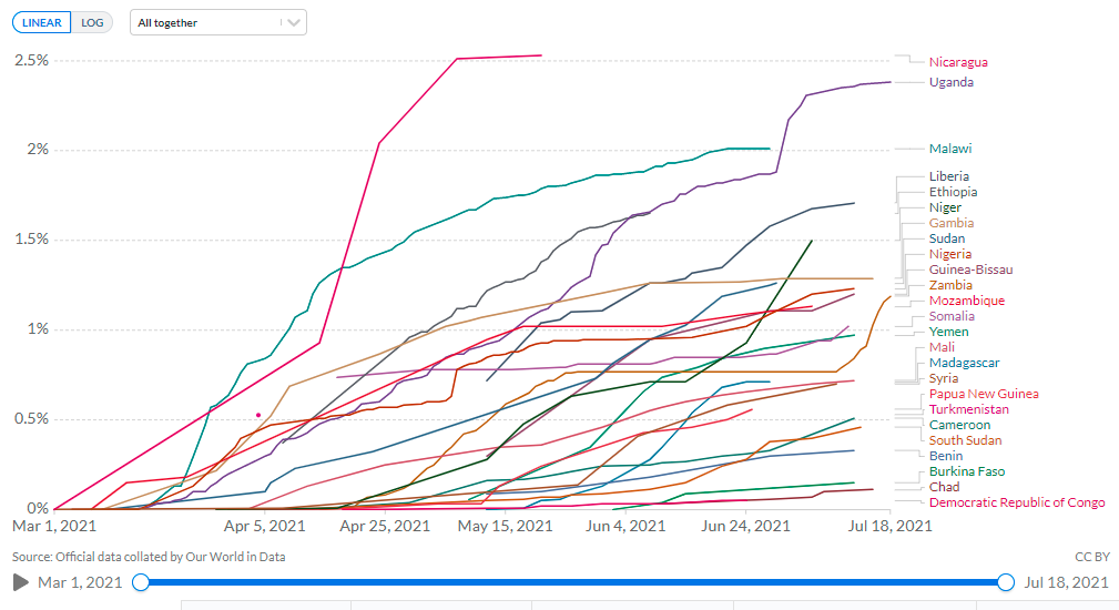
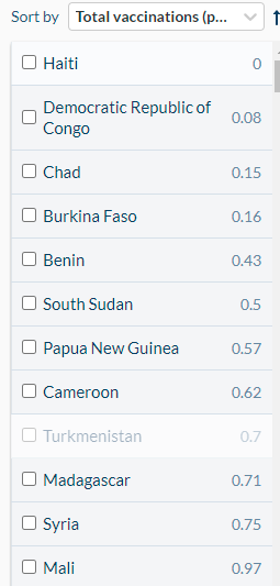
Below is a chart of the top 25 least vaccinated nations on earth
Top 25 most vaccinated countries on earth
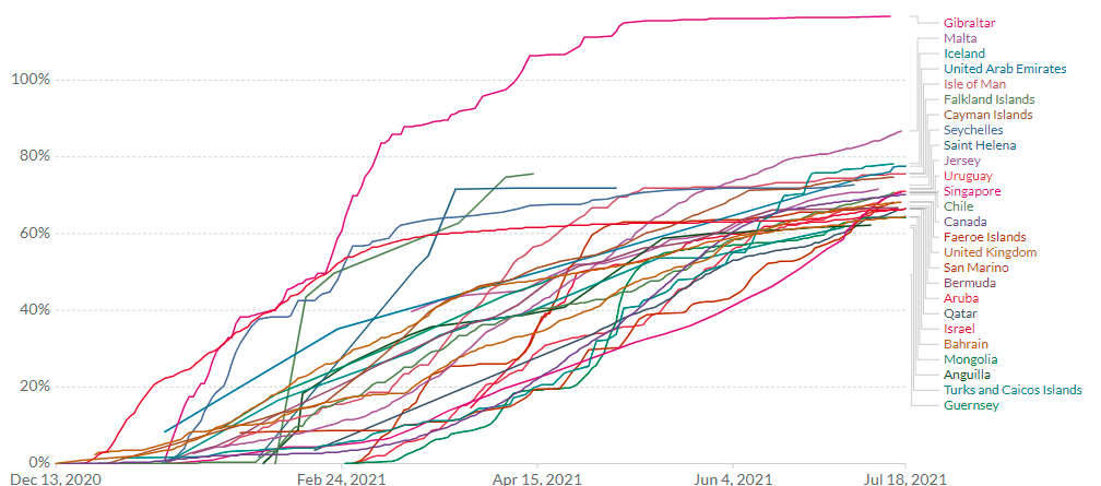
Before we make the adjustment of taking islands out of our most vaccinated list, there is 3 countries that still make the top 25 in terms of deaths per 1 million people. Those nations are Chile, the United Kingdom and San Marino which is an enclave that is surrounded by Italy.
After taking nations like Turks and Caicos and the Faeroe Islands etc out of the mix – we see an entirely different narrative begin to take shape.
Top 25 most vaccinated countries on earth minus island nations

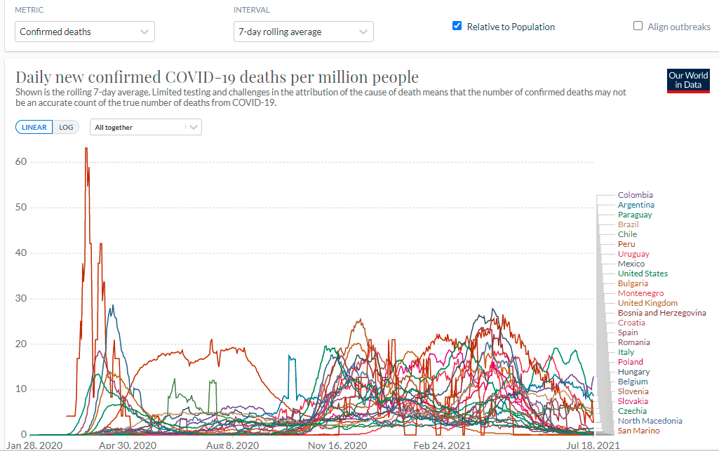
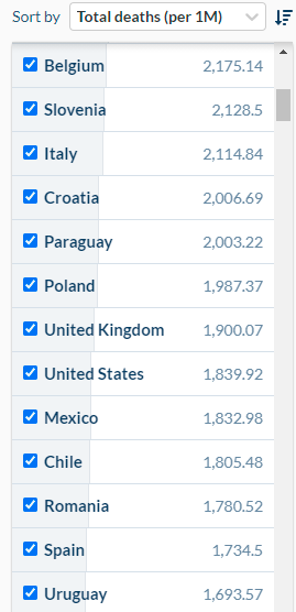
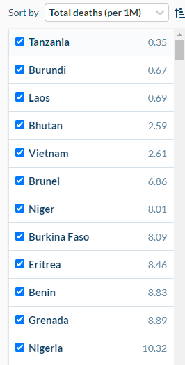
Top 25 countries in terms of deaths per 1 million
Countries that are in the top 25 for vaccination (island nations excluded) and that are also in the top 25 for deaths per 1 million is as follows:
- Chile – Is the 5th most vaccinated country (129.36 doses per 100) when excluding island nations and ranks #22 on most deaths per 1 million at 1805.48 deaths per 1 million.
- Uruguay – Is the 4th most vaccinated country (129.91 doses per 100) when excluding island nations and ranks #25 in the most deaths per 1 million people at 1693.57 per 1 million.
- United States – Is the 22nd most vaccinated country (100.99 doses per 100) when excluding island nations and ranks #20 in most deaths per million at 1839.92 deaths per 1 million.
- United Kingdom – Is the 8th most vaccinated country (121.18) when excluding island nations and ranks #19 in most deaths per 1 million people at 1900.07 deaths per 1 million.
- Spain – Is the 14th most vaccinated country (107.45 doses per 100) and currently ranks at #24 in terms of most deaths per 1 million people. Spain has experienced 1734.5 deaths per 1 million people.
- Italy – ranks 21st in terms of most vaccinations (101.79 doses per 100) and currently ranks at #15 in terms of most deaths per 1 million. Italy has experienced 2114.84 deaths per 1 million people
- Hungary – Is 16th in terms of most vaccinated countries with 105.13 doses per 100 people. Hungary ranks at #2 in terms of the most deaths per 1 million people with 3107.03 deaths per 1 million people.
- Belgium – Ranks #12 in terms of most vaccinations (109.59 doses per 100) and ranks at #13 in terms of most deaths per 1 million people with 2175.14 deaths per 1 million people.
- San Marino – Ranks #2 in terms of most vaccinations (132.74 doses per 100) and sits at #5 in terms of most deaths per 1 million people with 2651.89 deaths per 1 million people.
List of Deaths per 1 m (highest)

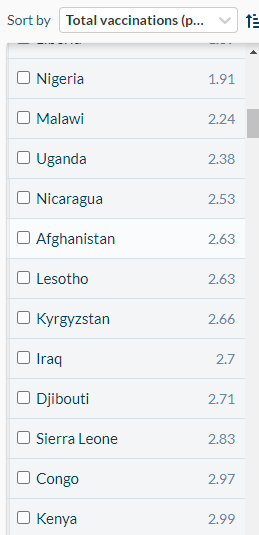
Consequently, in the group of the least vaccinated countries, 6 of the countries in the bottom 25 for vaccinations also placed in the bottom 25 for lowest deaths per 1 million. These countries include the following:
- Burkina Faso – Is ranked #8 in terms of lowest deaths per 1 million people (8.09 per 1 million) and is ranked #4 in terms of the least amount of vaccines per 100 people (0.16 doses per 100);
- Benin – Is ranked #10 in terms of lowest deaths per 1 million people (8.83 deaths per 1 million) and is ranked 5th in terms of the least amount of vaccines per 100 people (0.43 doses per 100);
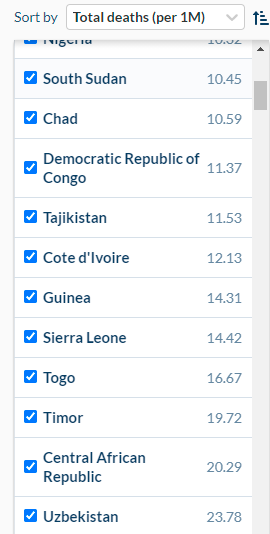
- Nigeria – Is ranked #12 in terms of lowest deaths per 1 million people (10.32 per 1 million) and is ranked #24 in terms of lowest amount of vaccines given per 100 people (1.91 doses per 100).
- South Sudan – Is ranked #13 in terms of lowest deaths per 1 million people (10.45 per 1 million) and is ranked #6 in terms of the least amount of vaccines per 100 people (0.5 doses per 100).
- Chad – Is ranked #14 in terms of lowest deaths per 1 million people (10.59 per 1 million) and is ranked #3 in terms of the least amount of vaccines per 100 people (0.15 doses per 100).
- Democratic Republic of the Congo – Is ranked #15 in terms of lowest deaths per 1 million people (11.37 per 1 million) and is ranked #2 in terms of lowest amount of vaccines given per 100 people (0.08 doses per 100).
Vaccinations (Lowest)
-
Vaccination rates per 100 (lowest countries) -
-

Total Deaths per 1 M (Lowest)

Relative Risk Reduction Vs Absolute Risk Reduction – How effective are the Covid Vaccines?
Perhaps you have heard that the Covid vaccines are anywhere in the range of 60-95% effective – giving the impression that they are highly effective at reducing symptoms and potentially limiting spread.
However, did you know that these numbers are derived from the relative risk reduction of the vaccine rather than their absolute risk reduction? What does this mean?
Absolute Risk Reduction of Covid Vaccines (reported in the Lancet) – “ARRs tend to be ignored because they give a much less impressive effect size than RRRs: 1·3% for the AstraZeneca–Oxford, 1·2% for the Moderna–NIH, 1·2% for the J&J, 0·93% for the Gamaleya, and 0·84% for the Pfizer–BioNTech vaccines.”
Relative Risk Reduction of Covid Vaccines (Lancet) – “95% for the Pfizer–BioNTech, 94% for the Moderna–NIH, 91% for the Gamaleya, 67% for the J&J, and 67% for the AstraZeneca–Oxford vaccines. However, RRR should be seen against the background risk of being infected and becoming ill with COVID-19, which varies between populations and over time.”
Absolute Risk Reduction vs Relative Risk Reduction – Vaccine efficacy is generally reported using a relative risk reduction (RRR). The RRR uses the relative risk (RR) which gives a ratio of attack rates with and without a vaccine.
As the report from the Lancet notes, “RRR should be seen against the background risk of being infected and becoming ill with COVID-19, which varies between populations and over time.” Pfizer, in their trial required a positive Covid test with just one of the symptoms they had compiled into a long list that included things like nausea, fatigue, headache or even a runny nose to be considered “Covid positive”.
Think about the implications of that for a moment. We know that in a Manitoba court, the governments Chief Microbiologist told the court that 56% of Covid positive tests in the lab weren’t actually infectious with anything.
This means that in the case of Pfizer, their protocol of only requiring a positive Covid test with one symptom from the long list of symptoms they compiled likely added many Covid “cases” that weren’t actually at risk of becoming ill with Covid-19.
Pfizer Considered trial participants Covid Positive if you had a positive test and one of these symptoms:
• Fever;
• New or increased cough;
• New or increased shortness of breath;
• Chills;
• New or increased muscle pain;
• New loss of taste or smell;
• Sore throat;
• Diarrhea;
• Vomiting;
• Fatigue;
• Headache;
• Nasal congestion or runny nose;
• Nausea
Same Data – very different representations – RRR vs ARR
Let’s demonstrate how the same data can be represented very differently using RRR and ARR. Let’s say there is a study of 100 workers in factory A and it revealed that 20 workers experienced back pain on the job. In factory B, a very similar workplace, 30 workers of 150 workers developed back pain. The absolute risk of developing back pain is simply the percentage of people affected. This is 20 per cent in both groups. In scientific terms, absolute risk is the number of people experiencing an event in relation to the population at risk.
Using the example above, the relative risk of developing back pain — comparing factory A and factory B — is 20:20 or one. That is, workers in factory A are no more (or less) likely to have back pain than workers in factory B. It’s 20 per cent for both groups. Now suppose workers in factory A were to receive exercise therapy for half an hour each day. One year later, we find that only eight of 100 workers have back pain, while the rate in factory B remains the same at 20 per cent.
The ratio now changes to 8:20. Eight is the risk per 100 workers in factory A. Twenty is the risk per 100 workers in factory B. If we divide eight by 20, this gives us 0.40, or 40 per cent. In other words, the relative risk of developing back pain in factory A is now 40 per cent of the risk in factory B. The absolute risk reduction of this measure however is just 12% – so you can see the importance of reporting ARR alongside of the RRR when it comes to vaccines.
Only giving participants the RRR data paints an incomplete picture and potentially compromises informed consent (in my opinion).
With the Absolute risk reduction of Covid vaccines pegged at less than 5% in the Lancet paper titled “COVID-19 vaccine efficacy and effectiveness—the elephant (not) in the room” we must ask if the data that these charts are presenting is confirmation of an ARR in Covid vaccines that isn’t all that impressive – what do you think?
Now it could be that the countries that place lowest in deaths per 1 million are not tracking Covid the same way that other nations are. As I said earlier, there are many different variables that need to be considered but the questions still need to be asked.
For instance, why are low vaccinated countries performing well in terms of deaths per 1 million people? Why are some of the most vaccinated nations on earth (top 25 excluding island nations) also leading the charts in terms of deaths per 1 million? Is this all due to error in the reporting of Covid statistics of different measures of tracking Covid?
I’m sure many will point out that different nations have tracked Covid differently and this could be showing up in the data – but why so many coincidences? Why are so many low vax nations doing well? Why is the entire continent of Africa experiencing far less deaths per 1 million people than North America and the European Union?
Another question that comes to mind is why is it that when adjusting for population that some of the most vaccinated places on earth have such high mortality? Again, this data needs to be interpreted as incomplete but it should raise some eyebrows and hopefully it will lead to some important questions being raised.

Diverge Media is an independent Canadian media outlet dedicated to bringing you the stories that matter. If you like our work – please consider purchasing merch or donating to help fund our work. None of our work would be possible without the generous contributions we receive from our readers/viewers. All the best – the Diverge Media team.
